用CSS切换横竖屏显示
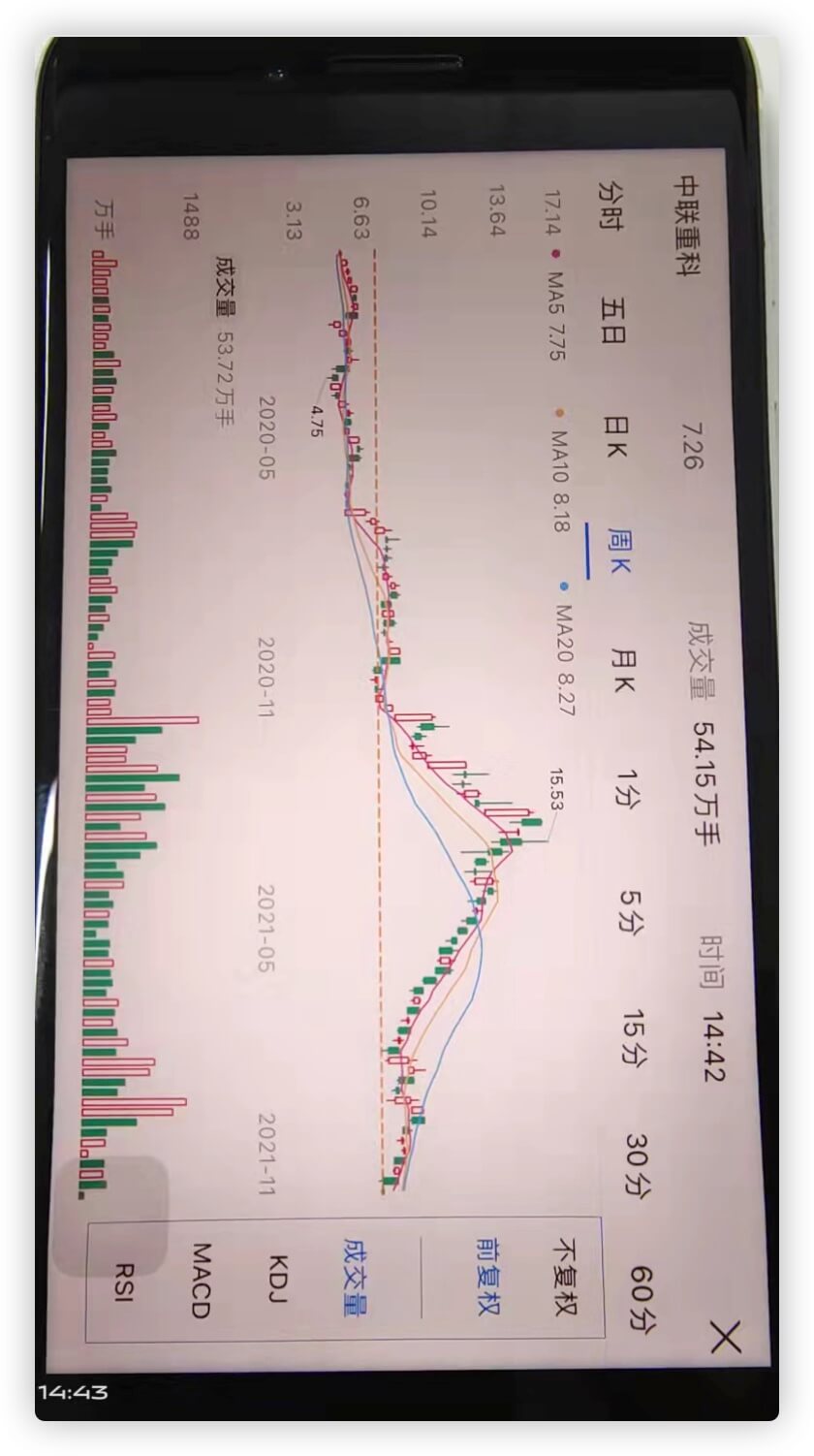
今天接到个需求,页面中的部分元素需要放大到全屏显示,并且是横屏方向显示,类似于支付宝中股票K线图的样式.
1
2
3
4
5
6
7
8
9
10
11
12
13
14
15
16
17
18
19
20
21
22
23
24
25
26
27
28
29
30
31
32
33
34
35
36
37
38
39
40
41
42
43
44
45
46
| <!DOCTYPE html>
<html lang="en">
<head>
<meta charset="UTF-8">
<meta name="viewport" content="width=device-width, initial-scale=1.0">
<title>Document</title>
<style type="text/css">
body{
margin: 0;
}
.wrapper {
width: 100%;
height: 100vh;
}
.button {
background: green;
width: 100%;
height: 100vh;
}
.box {
display: none;
background: yellow;
width: 100vh;
height: 100vw;
transform: rotate(90deg) translateY(-100vw);
transform-origin: 0 0;
}
</style>
</head>
<body>
<div class="wrapper">
<div class="button">竖向显示</div>
<div class="box">横向显示</div>
</div>
<script>
document.querySelector('.button').addEventListener('click', function() {
document.querySelector('.box').style.display = 'block'
document.querySelector('.button').style.display = 'none'
})
document.querySelector('.box').addEventListener('click', function() {
document.querySelector('.box').style.display = 'none'
document.querySelector('.button').style.display = 'block'
})
</script>
</body>
</html>
|